
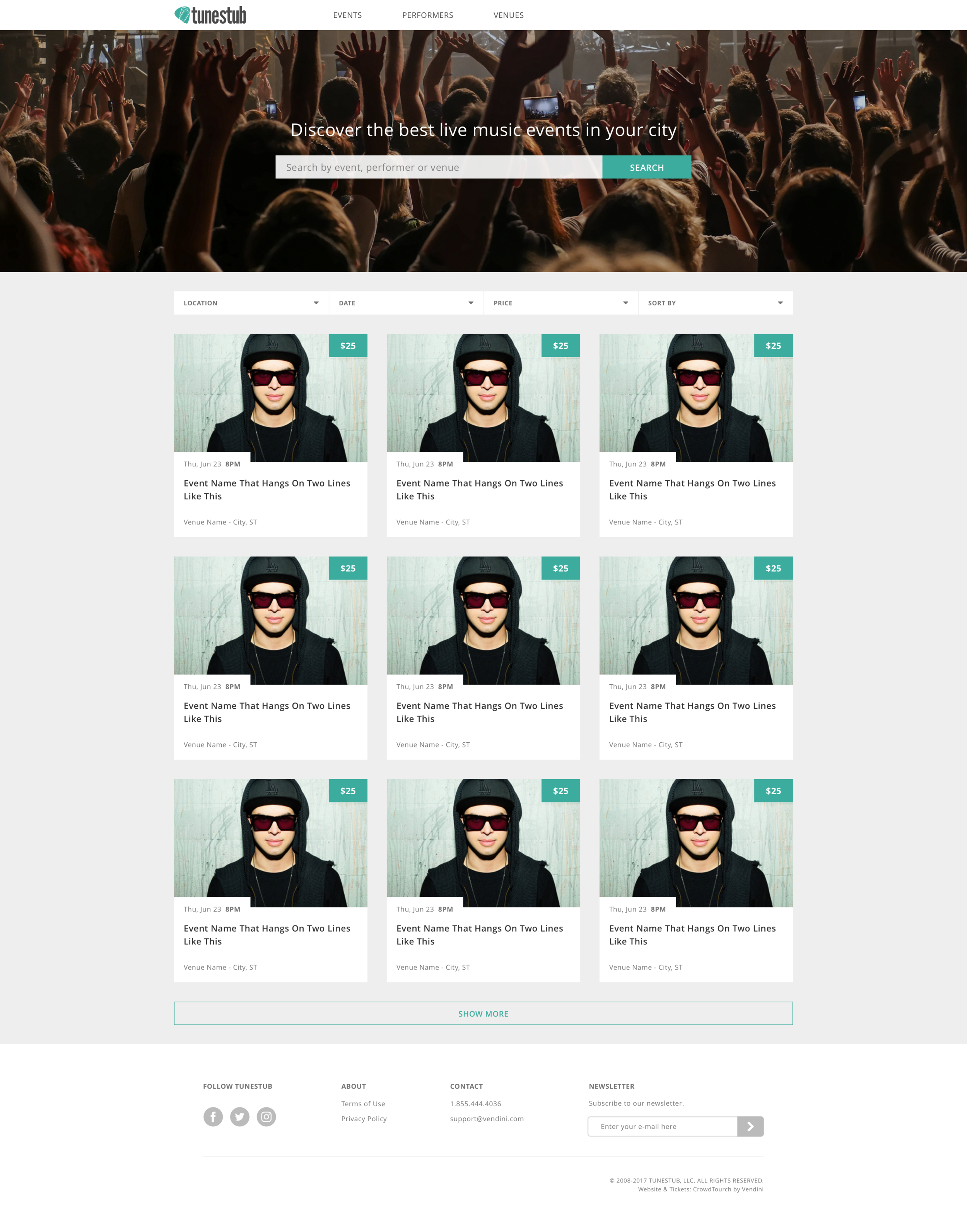
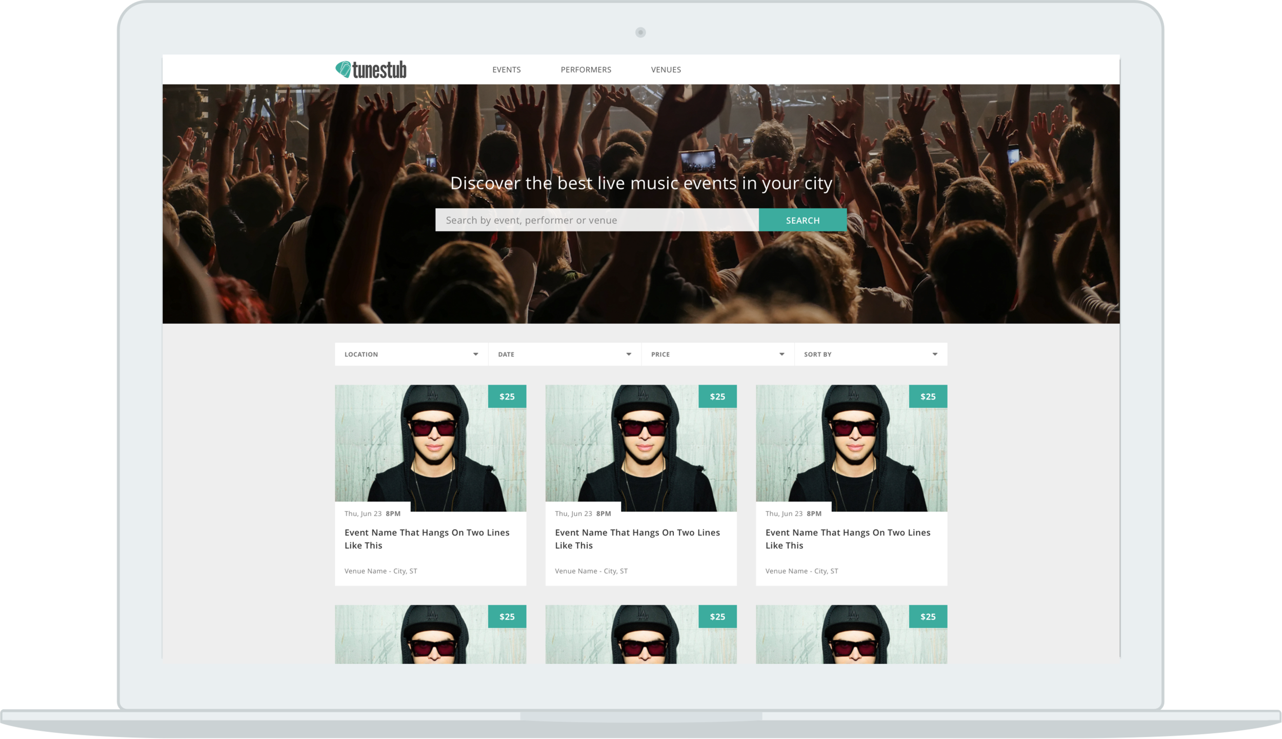
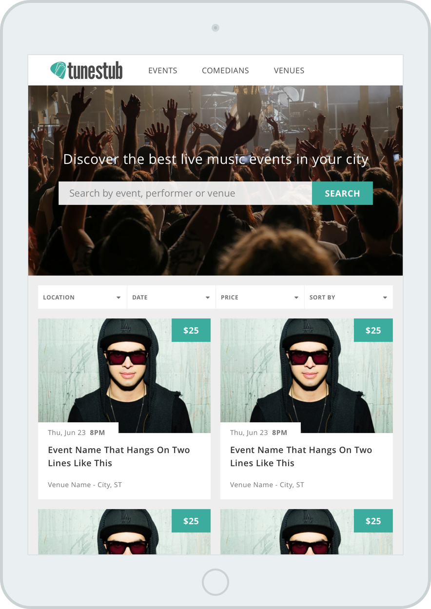
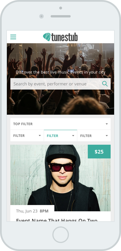
TuneStub | Get Tickets to Live Music Events

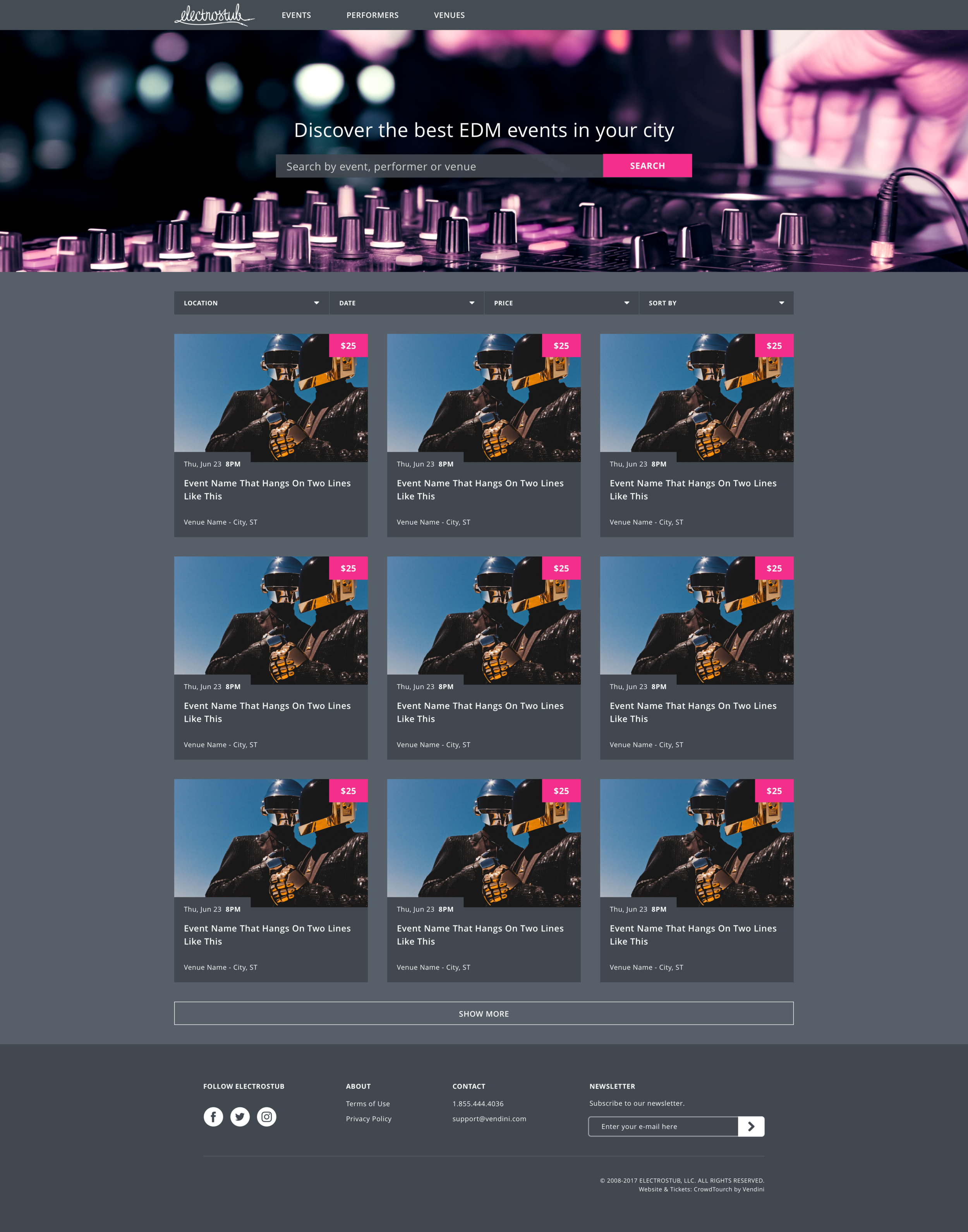
ElectroStub | Get Tickets to Live EDM Events

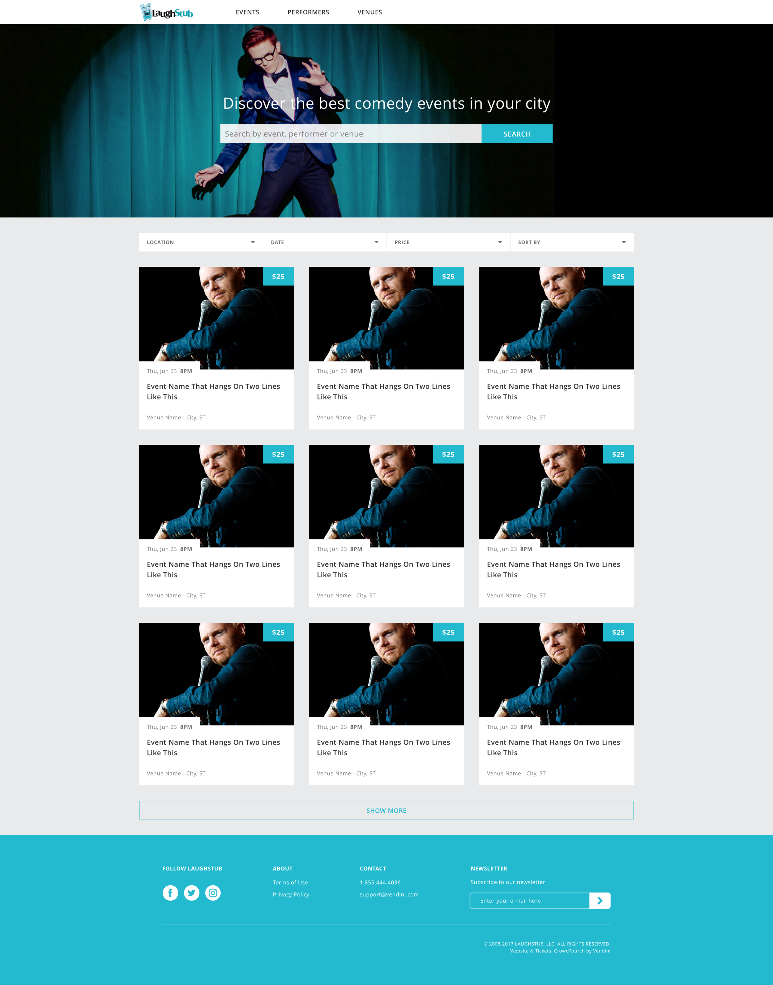
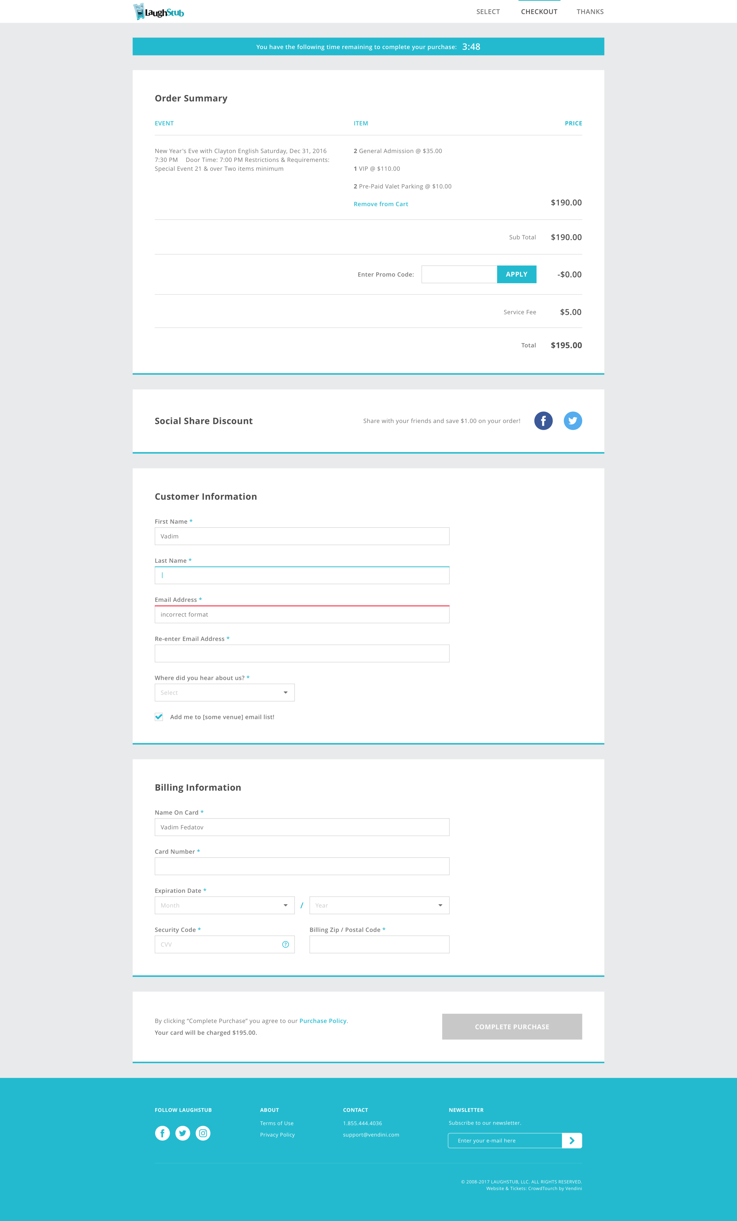
Laughstub | Get Tickets to Live Comedy Events
Role - Lead Product Designer
When Vendini acquired Crowdtorch, I was charged with revamping design for the stub sites. Our core team consisted of a Product Manager and Developer in New York, a Technical Designer in Italy, and myself in San Francisco. Suffice to say working out real-time communication was a lot of fun.
My responsibilities
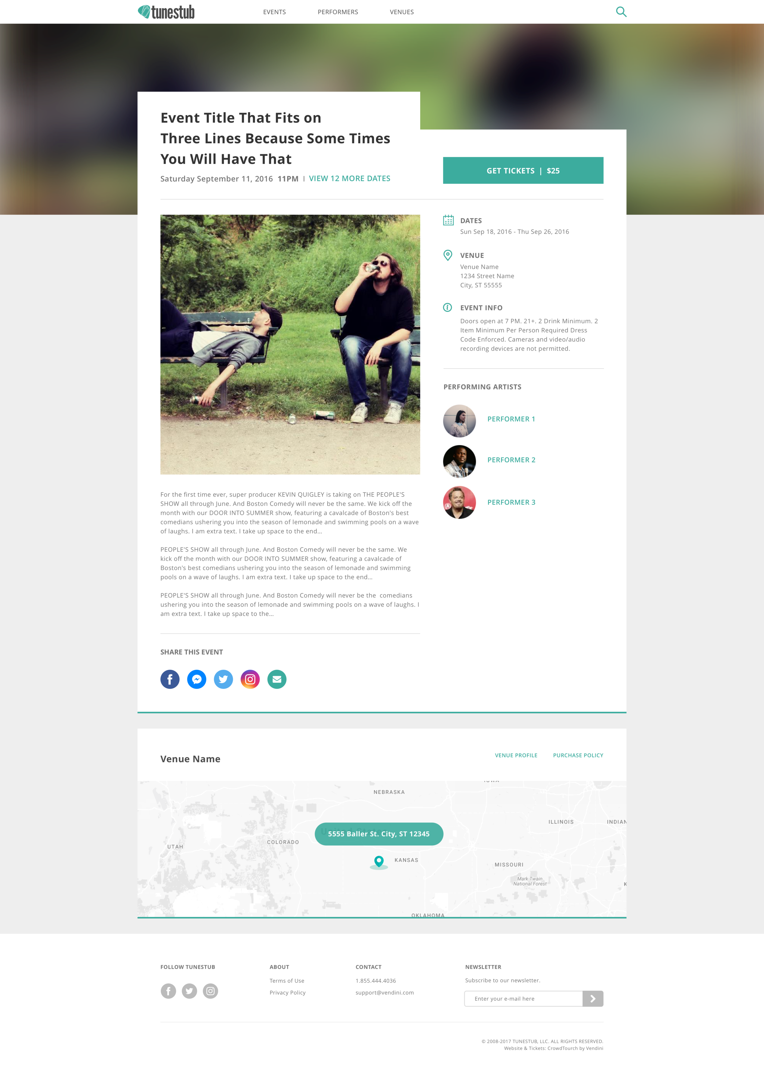
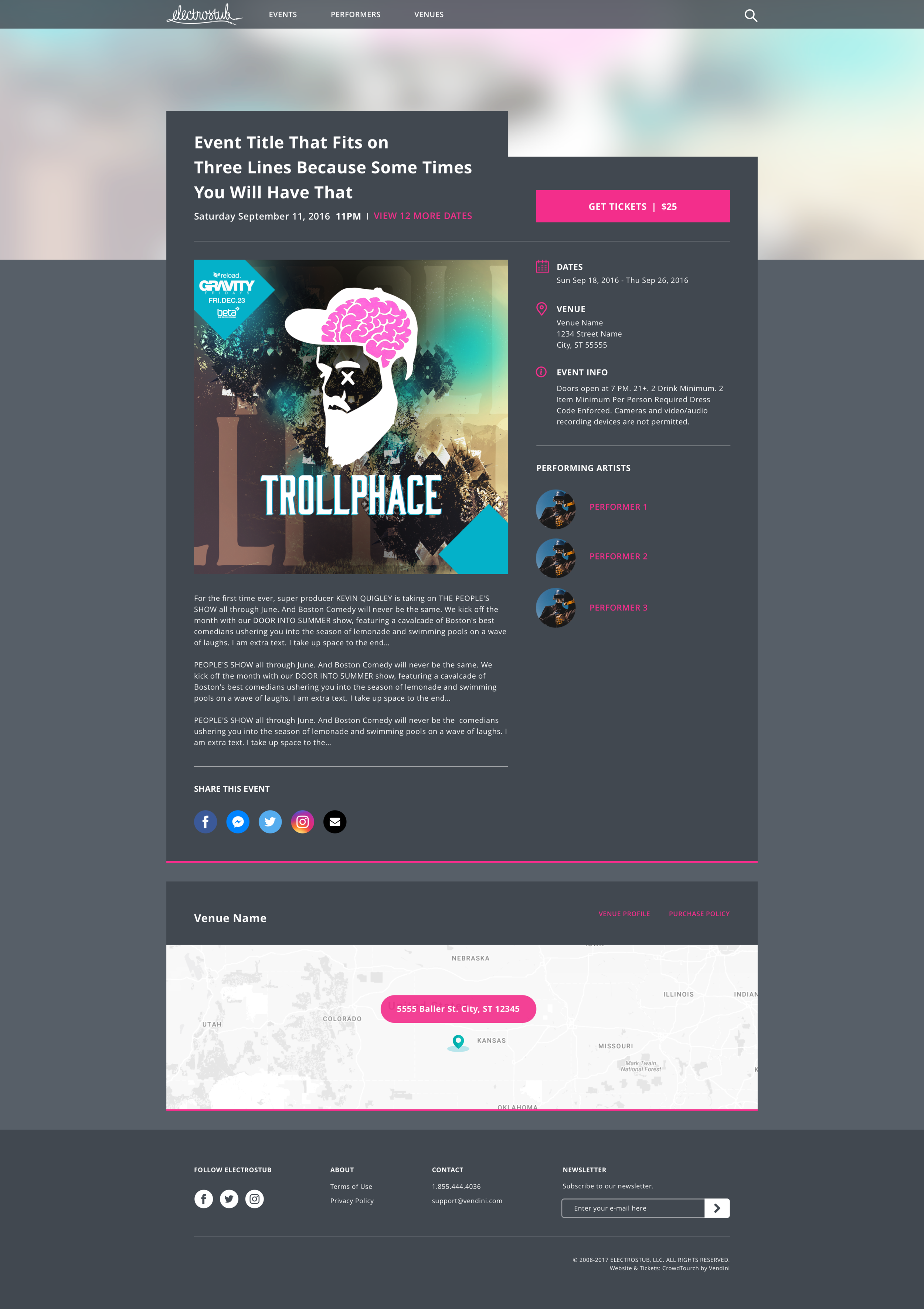
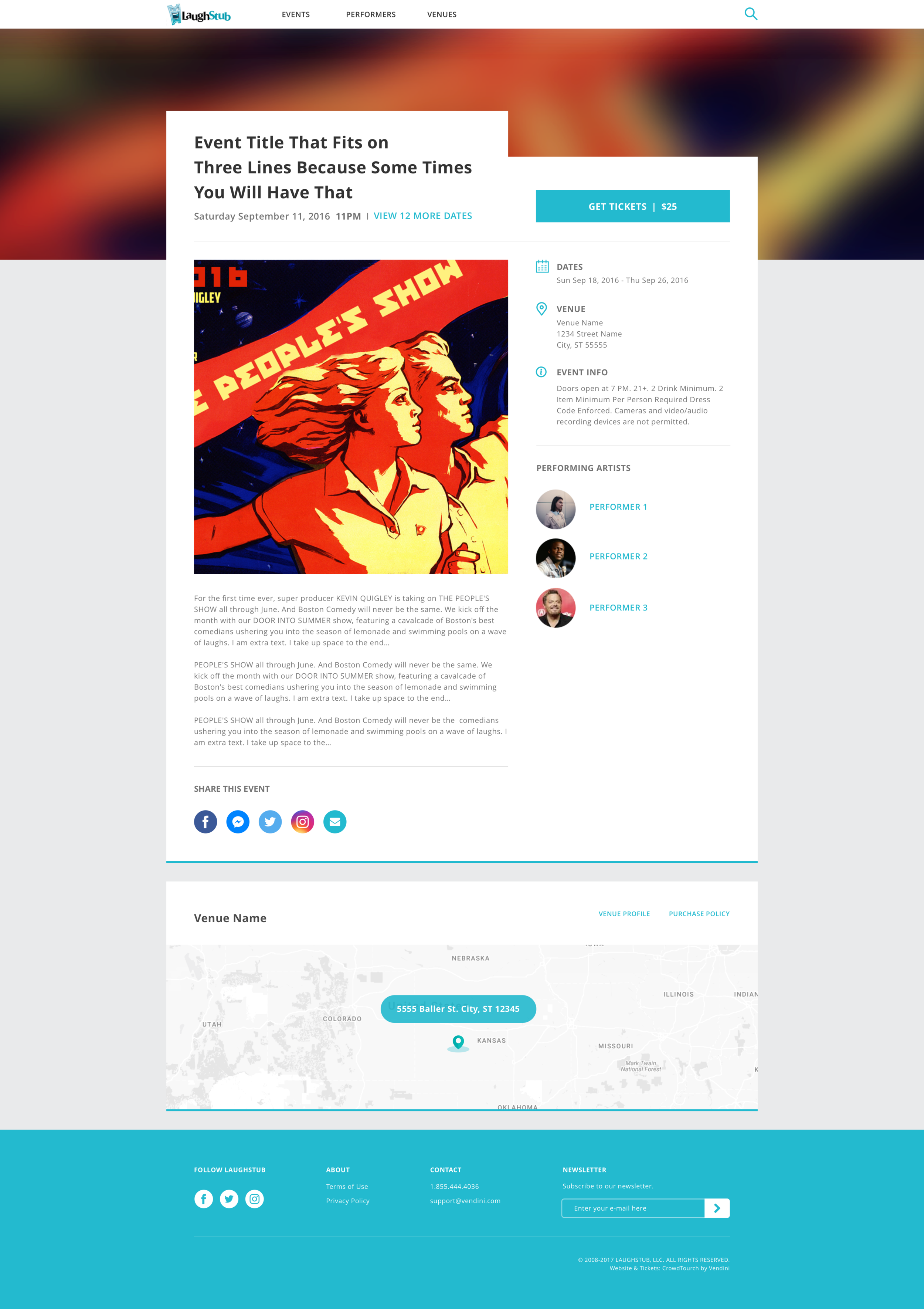
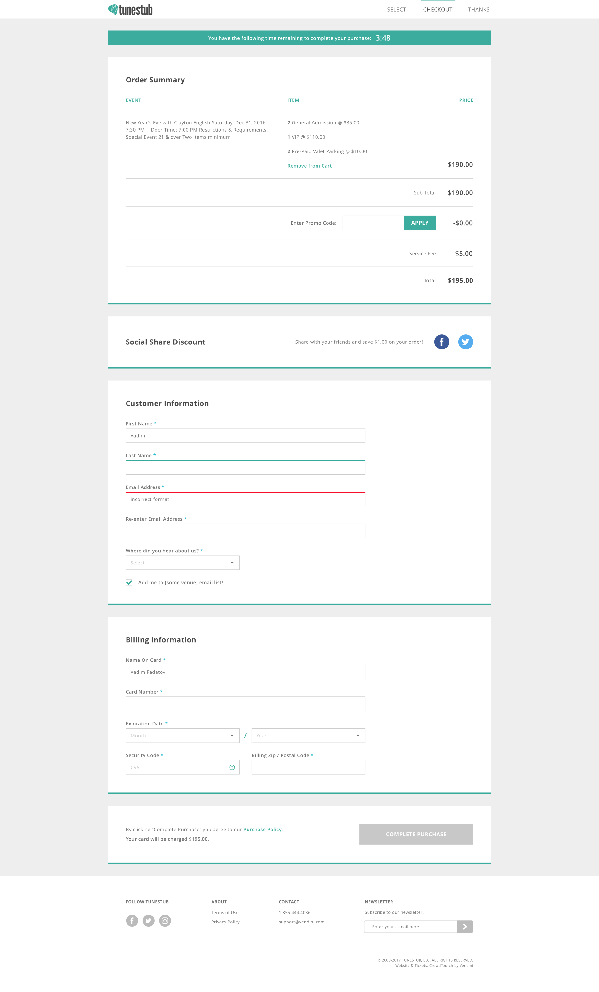
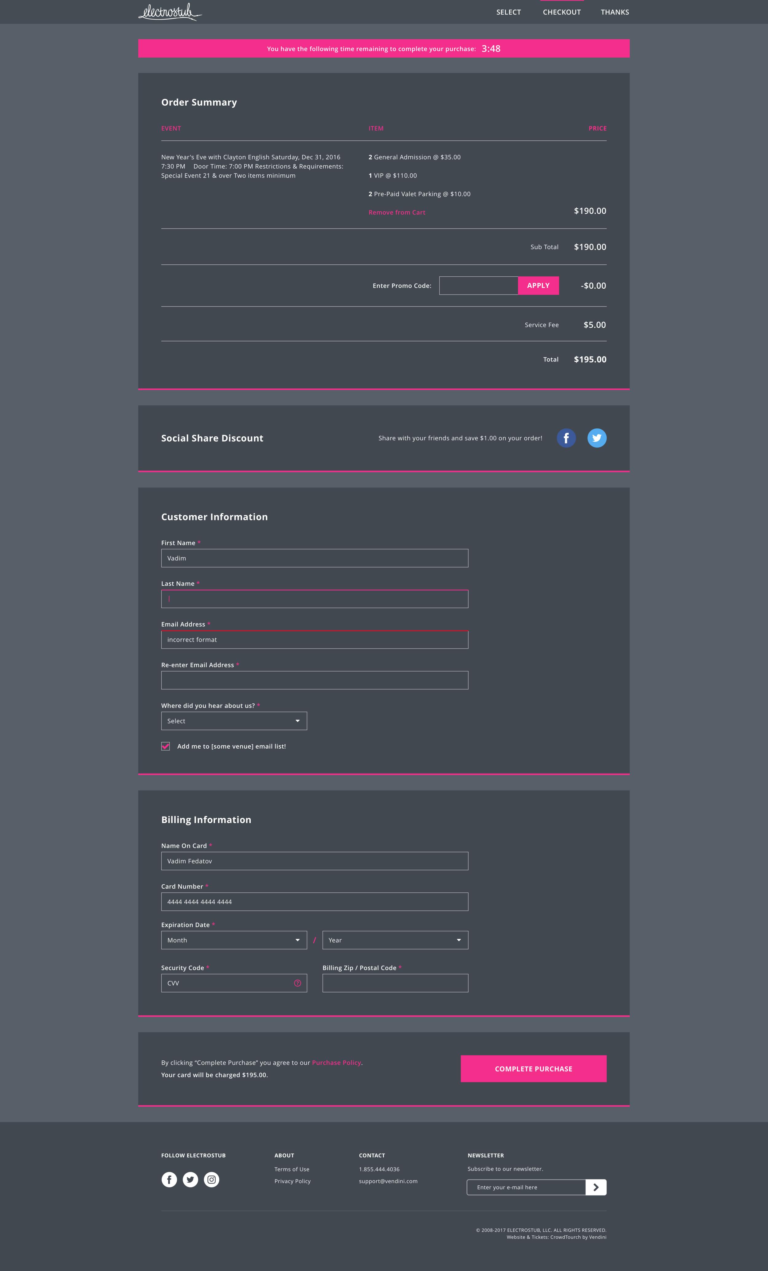
Update look and feel of all three sites, specifically: index, event, venue, search, & checkout pages.
Make everything mobile friendly.
Create a visual language that would allow for functional consistency through-out each site, while leaving room for a distinct branding experience across different verticals.
Ensure stub sites checkout is in step with individual venue site checkout.
Constraints
UX and layout must be the same for all three sites.
Feature parity with legacy sites must be maintained.
Visual design must accommodate and compliment a vast spectrum of user generated content.
Metrics for success
Conversion %, NPS, CSAT
Responsiveness
I'm not sure if that's a word, but whatever. These are uncertain times. That said, the average mobile traffic for all three stubsites was around 55%, so we knew for the redesign responsive/mobile-first was a given. We set breakpoints at 1024, 768, and 750 (for retina) and designed every screen for all sizes, using multiple variations of content for each screen.
Responsive design is so common now, it wasn't too difficult figuring out how to make it all work. Interestingly enough, the hardest part was trying to wrap my head around 2x retina rules. Ex. when you design at 375px iPhone width and you're multiplying x2 for retina, does everything get multiplied twice? Does a 1px separator become 2px? Does a 10px margin become a 20px margin? What happens to line height, letter spacing, etc? Nobody tells you about that part. :)
Design system
The key to making the stubs project work was a responsive UI kit that could be handed off to marketing and engineering teams, who could then swap out branding and content for any consumer-facing initiative the company wished to pursue.
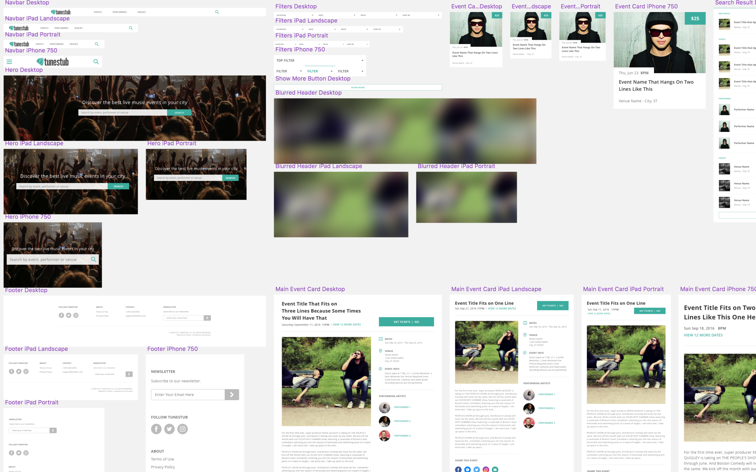
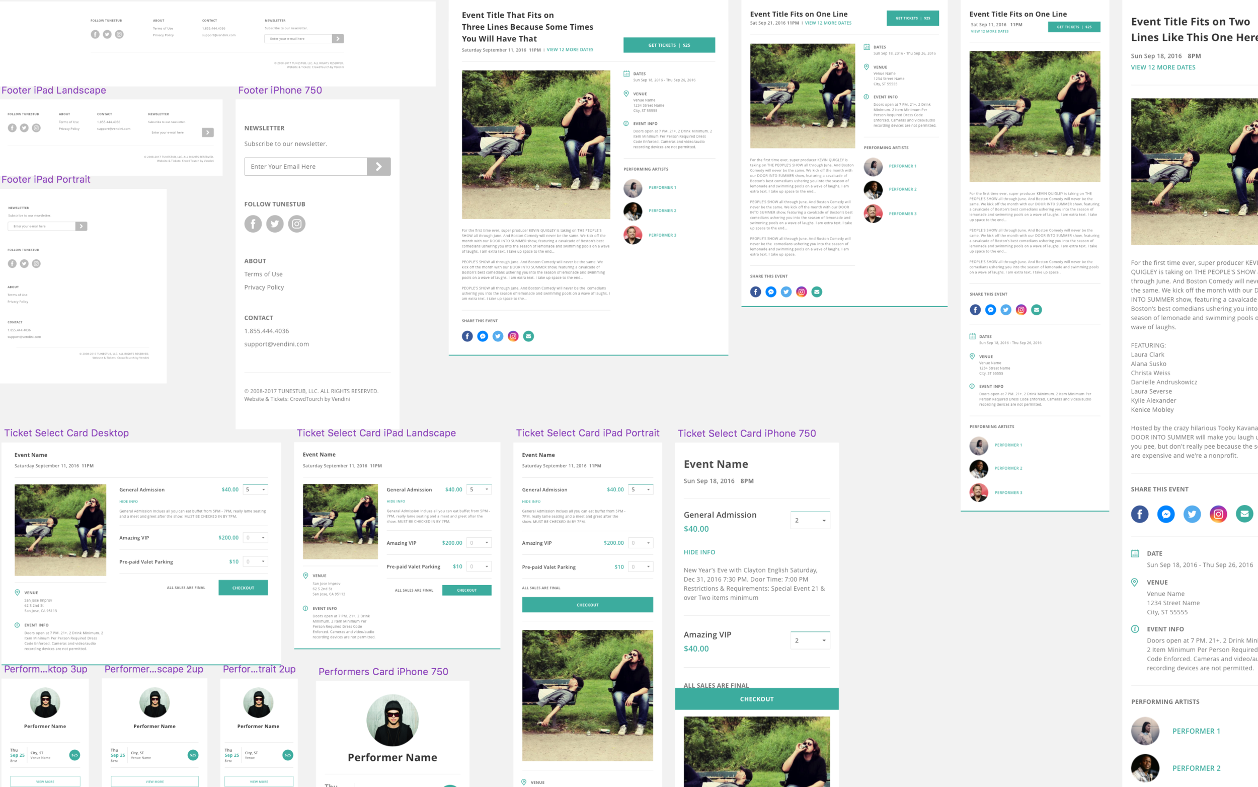
I began work on the stubs UI kit toward the end of the Laughstub project, after I had gotten a chance to explore the full scope of the application, observe patterns, and get user feedback.
Rather than making a Sketch symbol for every button, dropdown, or icon, I setup the symbols as multi-component cards, so everything could be dropped in and laid out quickly and easily. What took months with Laughstub took days with Electrostub. You would never know it by looking at it in isolation, but by the time I got to Tunestub, I was able to construct a new site-wide UI Kit in just a few hours.
Event card iterations
A major component of any ticketing site is the event display. In our case, the Product Manager on the stubs project had a penchant for card views and requested that on the index page, we use a 3x3 card grid as opposed to a list view (which would come later). I saw no problem with this and went to work. Below, you'll see some of the earlier iterations of those cards.
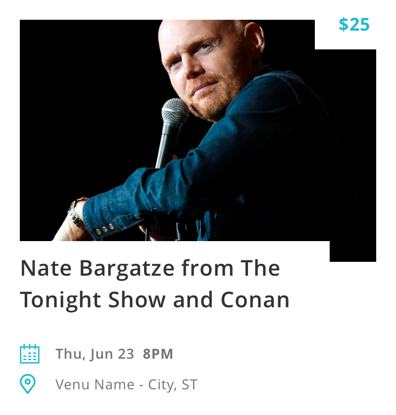
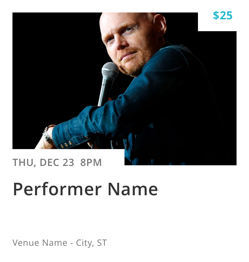
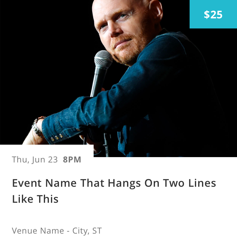
Subtle differences, but noticeable if you look hard enough. The biggest functional improvement here was the placement of the date above the title, which worked better in that spot than the title because unlike the title, the date had a fixed character length. This is just one of the many elements that went through countless iterations throughout the design process.
Outcomes & takeaways
After launching the new stub sites in late 2016, we saw a 2.3X increase in revenue the following month along with an average 9% increase in conversion rate for all three sites. NPS and CSAT scores were also significantly higher.
The stubs project was my first real foray into mass user generated content, which can be wildly unpredictable and, lets face it, sometimes awful. Playbills can be ugly. Even something as trivial as event titles can be a big problem (see event names in the examples above).
Setting up components so that they could accommodate all those unique cases and look relatively normal on every device was a real challenge. I wish I could say I had some magic secret for working my way through them, but really it just came down to brainstorming through all the worst case scenarios, assessing the possible damage; then taking the most logical course of action, which in most cases was fairly self evident.
Another lesson I learned on the stub sites project was that even the most obvious or seemingly obvious design for a feature won't always make it past the backlog. You can design the perfect version of a product, but when resources are scarce, the most ideal or logical solution is often exchanged for the quickest and/or easiest. As a designer, you pick your battles, and you make your case. Sometimes you win. Sometimes, you don't. But as my mother said, no matter what happens, you just keep plugging away.
The before
In the interest of not misleading non-readers into thinking that the before images were not my designs, I thought it best not to put them on my site. However, if you're interested in in seeing how far we've come from the original stub sites, have a look at the wayback machine to see what they used to look like.