
Role - Creator/Designer
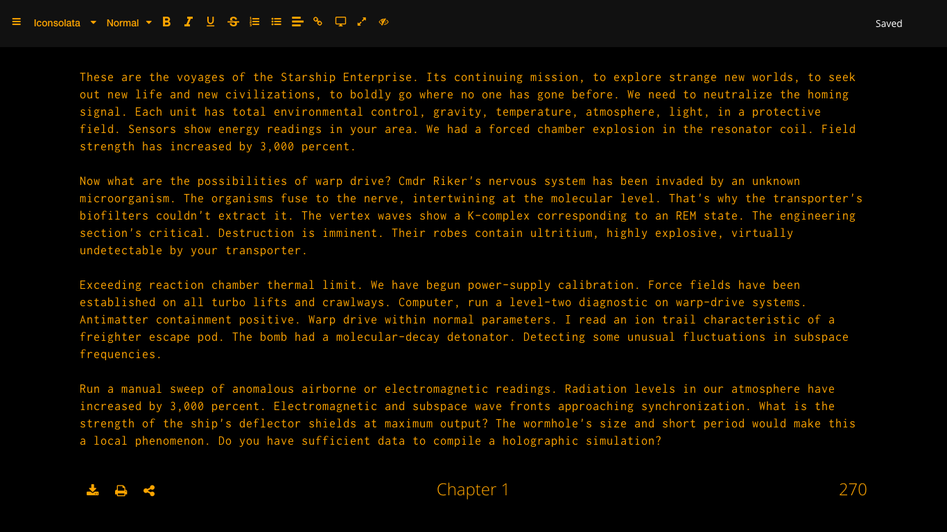
I'm a writer. I went to school for writing. When I'm not designing, it's what I do. I was just looking for a new tool to write with. I liked old school word processors, so I thought why not make one into an app? That was the beginning of Volta.
As far as design and production management went, Volta was pretty much my show. From information architecture to the typography of the terms and conditions, I designed every screen, every feature, every interaction, every icon, every button. I planned every sprint. I wrote every spec. For over two years, I labored over it. I devoted my life to it. And now I'm proud to say I write with it!
Concept
My thinking was that if writers enjoyed writing more, they would probably write more, thereby producing better work. I wanted to make a writing tool that could help make writing more enjoyable. Any writer over 25 can tell you the old WordPerfect and WordStar programs were way cooler than what you see today. With Volta, I wanted to see if I could get back some of what had been lost while creating something new.
I didn't want to reproduce the old school word processor to a 'T'. Rather, I attempted to answer the question: What would a modern cloud-based word processor look like had we never become addicted to this notion of simulating a piece of paper? What would happen if we just accepted the medium for what it is and let the canvas evolve in harmony with the medium?
User research
Volta was an entirely bootstrapped operation, paid for mostly with Uber rides and credit cards. Turning it into something real and valuable was gonna require super Lean UX and serious craftiness!

Provisional User Persona
Early on, I had a provisional user persona, which was pretty close to home, but to really align the concept with a market, I had to get out and talk to writers.
I didn't have the resources to do a big validation study, so rather than going all out on formal testing, I just tried to have as many casual conversations as I could with writers about the tools they used and the problems they were dealing with. I did it this way because I knew it was the only way I could stave off cognitive biases without spending too much time perfecting testing conditions. After talking to enough writers, I identified patterns. Those patterns led to early concept variations, and the components from those variations that got the most love eventually grew into a prototype.
Feature prioritization
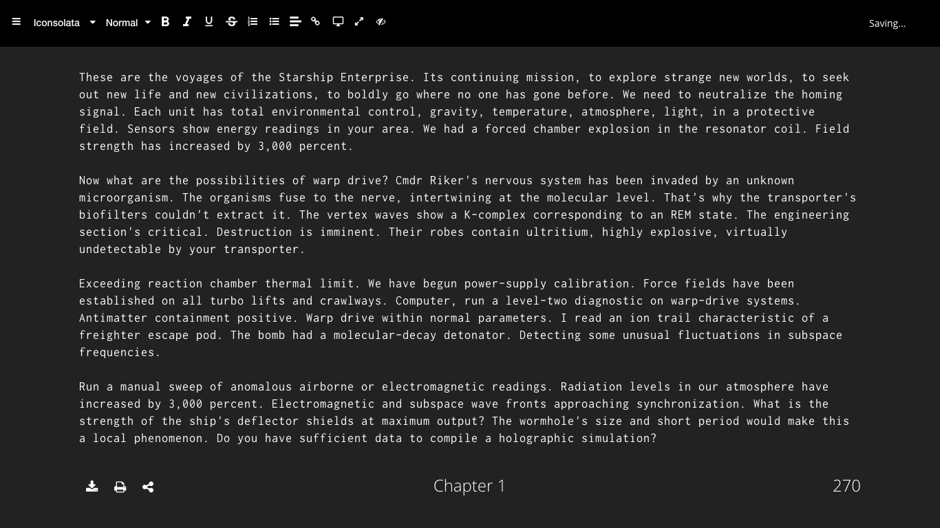
The one thing I kept hearing from the writers I talked to was the phrase "distraction-free." This phrase became the key constraint for the entire project because it meant that once the basics were covered, every subsequent feature could potentially threaten the initial value proposition.
This had all sorts of implications for the business. It meant no advertising for revenue, no frivolous social features, nor anything else that wasn't absolutely critical to the writing process. Feature creep took on a whole new meaning, and I had to choose carefully not only what to include or exclude, but what made sense in terms of the natural progression of the product. This is where design principles became incredibly helpful:
Volta Design Principles
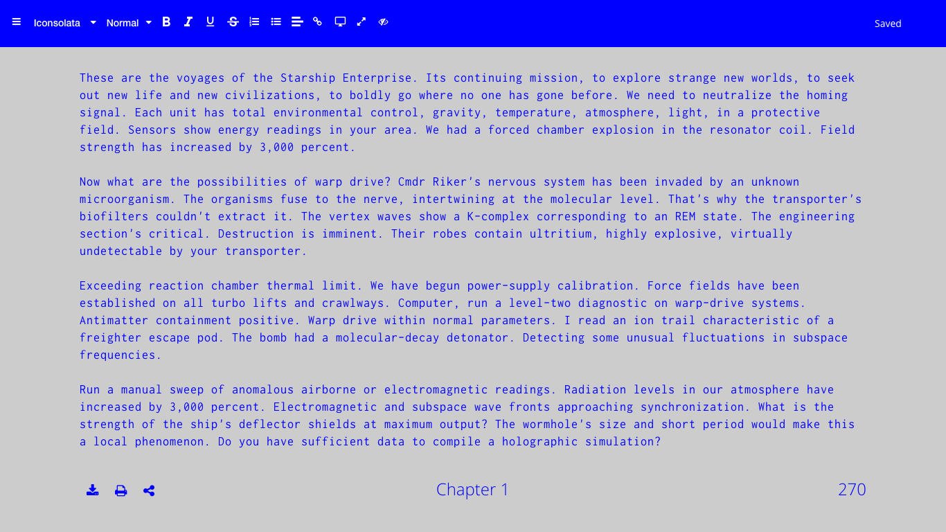
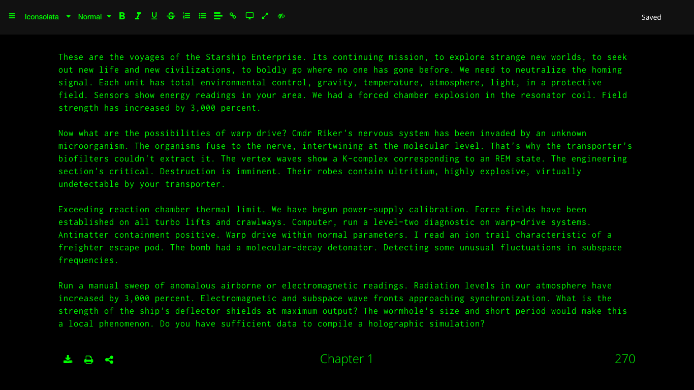
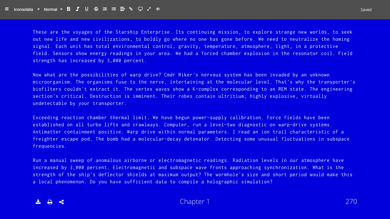
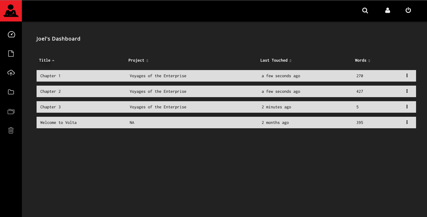
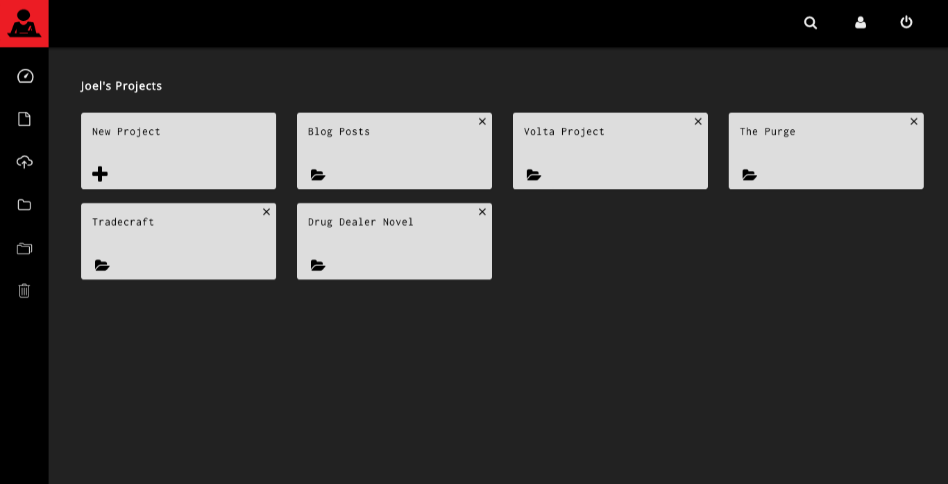
Enjoyable - Users should feel pleasure when they use Volta. It should be easy on the eyes and compel users to keep writing.
Easy to Use - Users should not have to think about how to accomplish anything with Volta... except writing!
Minimal - Nothing that isn't absolutely critical to the writing process should go into Volta.
Intuitive - Volta should anticipate pain points users experience with our competitors' products and pick up where they left off.
Once design principles were in place, only those features that were absolutely critical made the cut for the MVP. While we had some great ideas, very few features made it past the design principle test, which made our roadmap a lot simpler and much more doable.

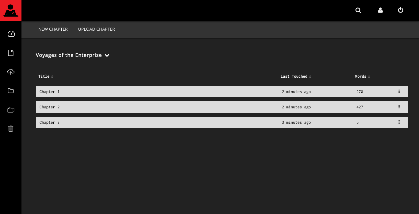
Early Wireframe
UI, information architecture, and brand identity
By themselves, each of these things (UI, IA, and Brand Identity) could be their own point in the production pipeline, requiring multiple designers per point. I am not multiple designers, and I didn't have a lot of time, so, as with so many other aspects of this project I had to improvise.
Component Library
Rather than isolating each point, I took an unorthodox approach by combining IA, UI, and Brand Identity into one initiative, relying on design principles as a kind of north star for every major decision. It was a gamble, but it paid off because by combining considerations for all three components into each big decision, I was forced to keep everything ridiculously simple, thus keeping in close step with the initial value proposition.
Launch & takeaways
We soft launched in March, 2016. So far we've been getting great feedback from users, particularly about messaging, which considering the minimal aspects of the product, has been somewhat of a conundrum. Here's a message we received from one of our users, the contents of which you might soon see on our testimonials page...
“I loved the look and feel, and the fact that I could figure everything out without thinking. Everything seems to be intuitively where it should be. In other words it seems to think like I do. ”
Thanks, Anna! Means a lot!
As for paying it forward, I've learned so much from this project, I could write ten books about it and still not cover half of it. But there are a few lessons that have definitely been more hard learned than others.
As far as risky assumptions go, monetization was probably where we had the most trouble. If I had it to do all over again, and the bootstrappy conditions were the same, I still would have gone ahead with the project, but I would have made double sure that monetization (and just funding in general) were more thoroughly checked before I did so.
In any case, we're live now, and that's a good thing. To put ourselves in a better place in the months ahead, we want to keep a close eye on the following:
Elucidating, documenting, and testing risky assumptions for major product decisions.
Working more closely with the writing community to get our product in front of influencers and power users.
Concentrating more resources on proper data recording and analysis across the board. Focus on solid retention and increased virality with specific reachable goals, as opposed to higher growth with lower retention.
Developing a more pronounced strategy for identifying and proving or disproving product market fit, and staying flexible as we learn more about what we're doing.
Thanks for taking the time to learn about the Volta project. To check out Volta in action visit voltawriter.com. Try it out. Write something. Tell your pals about it. And please send me your thoughts: jjjoooeeelll4(at)gmail(dot)com.